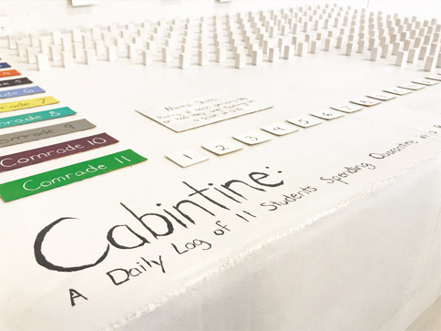
Cabintine
Project by Katie Bacher
In the midst of the Covid-19 pandemic, the novel coronavirus seems to be the only topic of conversation. A tidal wave of statistics, fatality rates, and haunting predictions of the future consumes our media and has placed a cloud of uncertainty over the world. I was inspired to make project related to COVID-19, but I did not want to make a typical visual exploring numbers of cases or deaths, as there are plenty out there already; I wanted this to be more human and personal. Thus, I am using a self dataset: a log of my friends and my time in quarantine since school was dismissed. We stayed together in a remote cabin and kept a daily log of how we handled new patterns of daily life. The dataset contains an entry for each day that has a day title, highlights and key events, a quote someone said that day, all of our mental states (a rating of the day or how we feel on a scale of 1-10), and a descriptive word for our day. My goal for the project is to capture this moment in time and take a look at how we as a group of college students were affected by the situation.
Inspired by the creative outpouring of people stuck at home, I chose to make a data physicalization (a physical representation of data) for this project out of found materials, using mostly cereal boxes and cardboard, to represent the data. Without access to modern fabrication tools, like 3D printing or laser cutting, everything was made by hand and all of the color and text was hand-painted.
Below is a description and discussion on the final product. Accessible from the menu button above, the Process page details the making of the project and the Documentation page shows the final deliverables (a paper and summary video).
Project Description
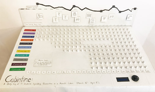
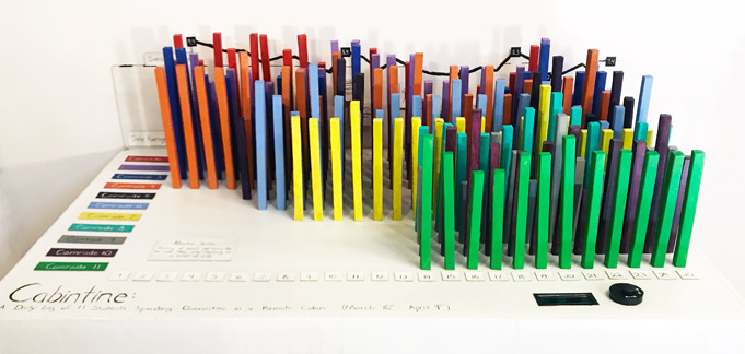
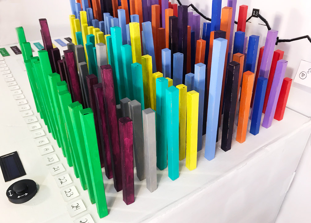
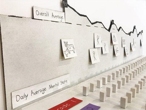
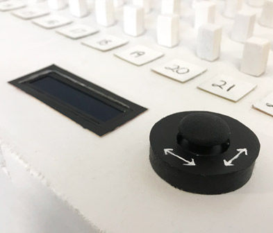
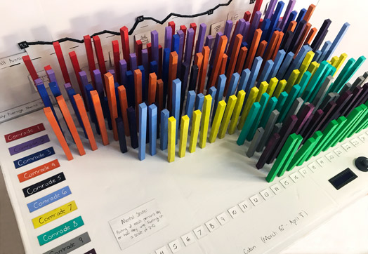
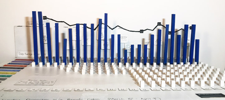
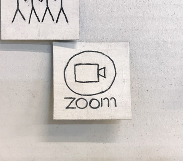
What I ultimately created was a 3 axis bar chart of the mental states. On one axis is the cabin members, labeled as numbered comrades for anonymity, and the other axis shows the day, starting with Day 1 on March 16th, when people first started moving into the cabin. The z axis represents the comrades’ mental states for each day with the height of the bar equaling the mental state in inches. I include a backboard line chart showing the daily averages. Also on the backboard are icons representing some of the key events that happened throughout the time in the cabin, such as more people arriving, celebrating Comrade 4’s birthday, Zoom classes starting or our internet going out and suspending virtual learning for a few hours.
There are 3 main modes of interacting with the piece. The first is flipping through the icons on the backboard. Behind each icon is a short description of what it represents. The second, and main, mode of interacting with the visual is physically moving and touching the bars. Each bar is independently removable, affording users flexibility to add and remove the bars as desired. This allows for a physical filtering where any a subset of the total bars can placed and users are not limited to filtering capabilities encoded by the designer. Additionally, bars can be picked up, inspected, and physically compared to other bars in the chart. The final mode of interaction is the joystick that controls text on the LCD display. This allows users to click through all the day names and the comrade’s daily words.
Images
Discussion
Through the creation of and interaction with this piece, several interesting observations about my dataset became apparent. For one, there was a clear downward trend throughout the time period included in the visual and an noticable drop-off when zoom classes began on Day 15. There was, however, always a rebound on weekends. This indicates classes may have been a low point of quarantine for some. That aside, once the initial excitement of moving into the cabin passed, people may also have been getting restless and sick of being stuck inside.
Another interesting insight was that two of the most common day description words were lazy and victorious, which I found slightly ironic. The words as a whole span the spectrum of emotions, from from thoughtful, creative, and active to disheveled, unmotivated and overwhelmed. Sometimes oscillating between several different extremes of the course of a couple days, the words highlight the complex array of emotions many felt during these unusual and uncertain times.
Throughout the process of making this project, I came to understand why physicalizations have only recently become more prevalent. Since I made everything by hand, construction of the 200 boxes alone — measuring, cutting, and gluing them together — took me on the order of 40-50 hours, and that does not include painting or assembling the rest of the visual. The advent of modern fabrication techniques makes more complex physicalizations — in terms of structure and data size — increasingly viable.
Aside from that, I learned a couple interesting capabilities afforded by a physical representation of data. For example, having 3 dimensions, as opposed to a 2-dimensional computer screen, made it easier to display higher dimensional data. I was able to have a 3 axis bar chart and include a line chart showing the averages behind it, which would be much harder to represent as effectively in 2D as one dimension would have to be collapsed. Existing in real space, physicalizations allow users to walk around the visual and view trends along each dimension.
Being able to pick up and manipulate the bars themselves is unparalleled in the digital realm. This method is so tangible and affords the user much more flexibility than digital interaction modes. The biggest drawback with physical manipulation, however, is the time it takes to remove or replace large sets of bars if significant filtering is attempted. For example, setting all the bars into place the first time took me about 20 minutes, although starting from the blank board and only setting up a couple rows to compare takes significantly less time.
As I developed my project, I was interested to see what visualization techniques translated from digital to physical. I used traditional encoding with the bars and line chart to represent the numerical data. I found it more difficult, however, to include unstructured data, as text clutters the visual and takes up space. All of the immediately visible text in my project are labels and titles. In a digital medium, textual data could be explored through tooltips or scrolled through in a narrative visualization. I ended up using a tooltip-like equivalent with my icons that must be flipped up in order for users to read the description underneith. Additinoally, I implemented a discretized scrolling feature with the joystick as a way to explore the daily textual data without cluttering up the bars or elements of the visual with this information. All of the interaction methods for exploring the narrative and textual data in my design were entirely user driven. Perhaps future work could be done to explore what methods of designer-directed narrative techniques could be facilitated in a physical medium.